Count em!
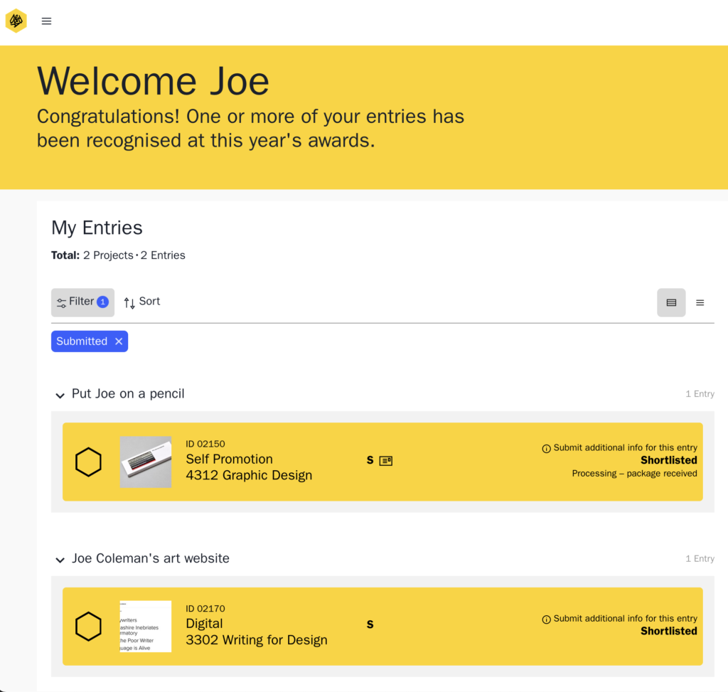
09 January 2025Two bloody D&AD awards shorllists for two different personal projects. Get in.
Read more on LinkedIn
Two bloody D&AD awards shorllists for two different personal projects. Get in.
Read more on LinkedIn
I’ve honestly not found any use for it whatsoever.
Writing is the one thing I know how to do. I don’t need help from something that’s as basic and derivative as ChatGPT.
Read the full article on LinkedIn
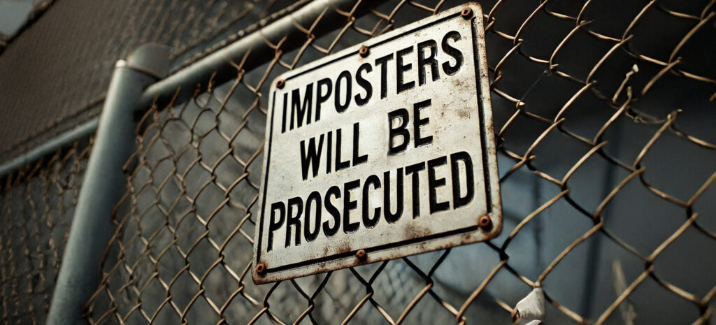
What if it’s not “imposter syndrome”? What if it’s your gut telling you that your skills are woefully inadequate to complete the task you’ve taken on? Here’s my cautionary tale.
Read the full article on LinkedIn
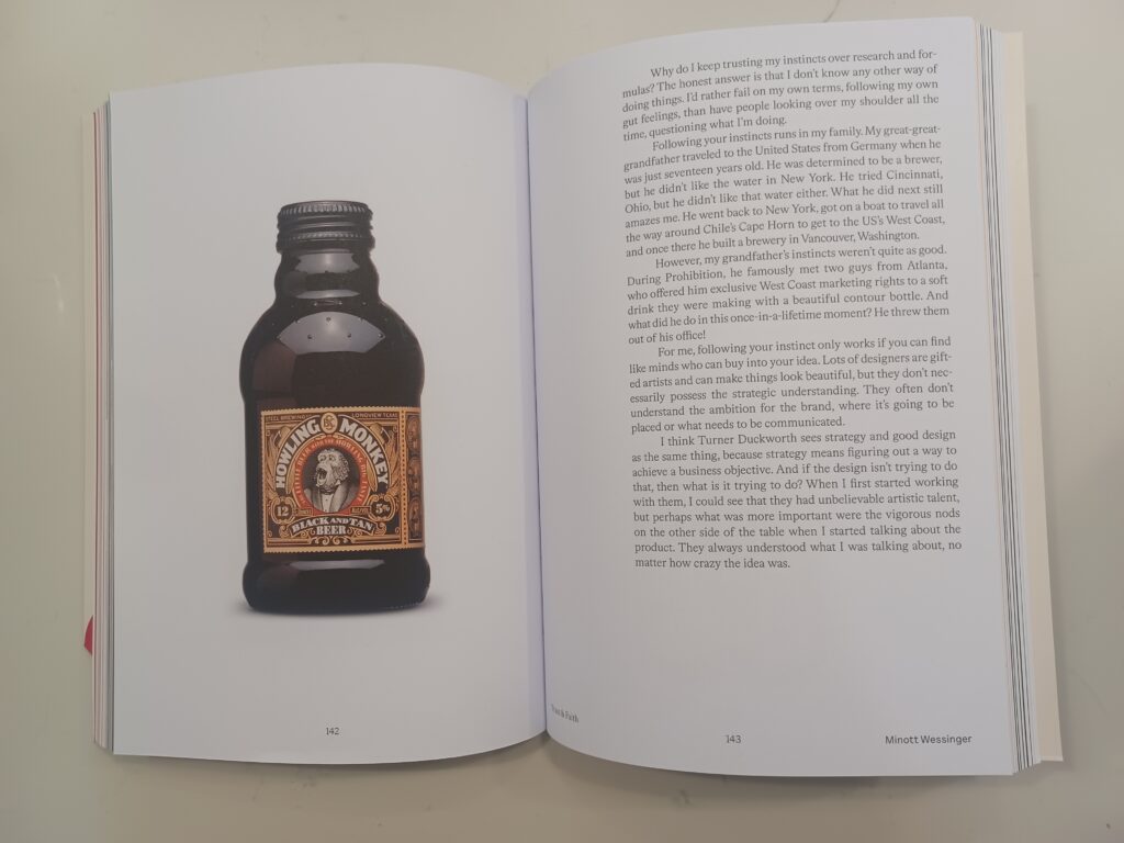
I helped edit Minott Wessinger’s autobiographical chapter in Turner Duckworth‘s new I Love It What Is It book by Gyles Lingwood (published by Phaidon). His story is truly and honestly a belting read.
More pics on LinkedIn
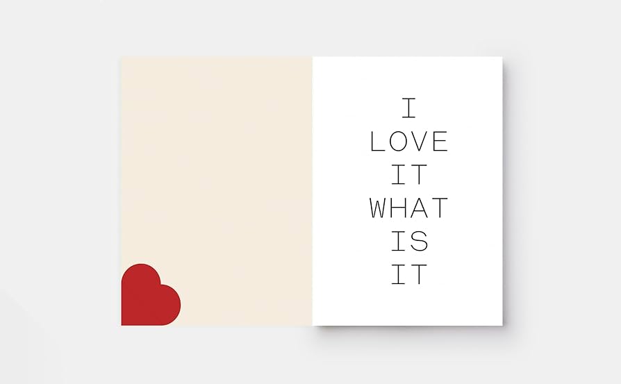
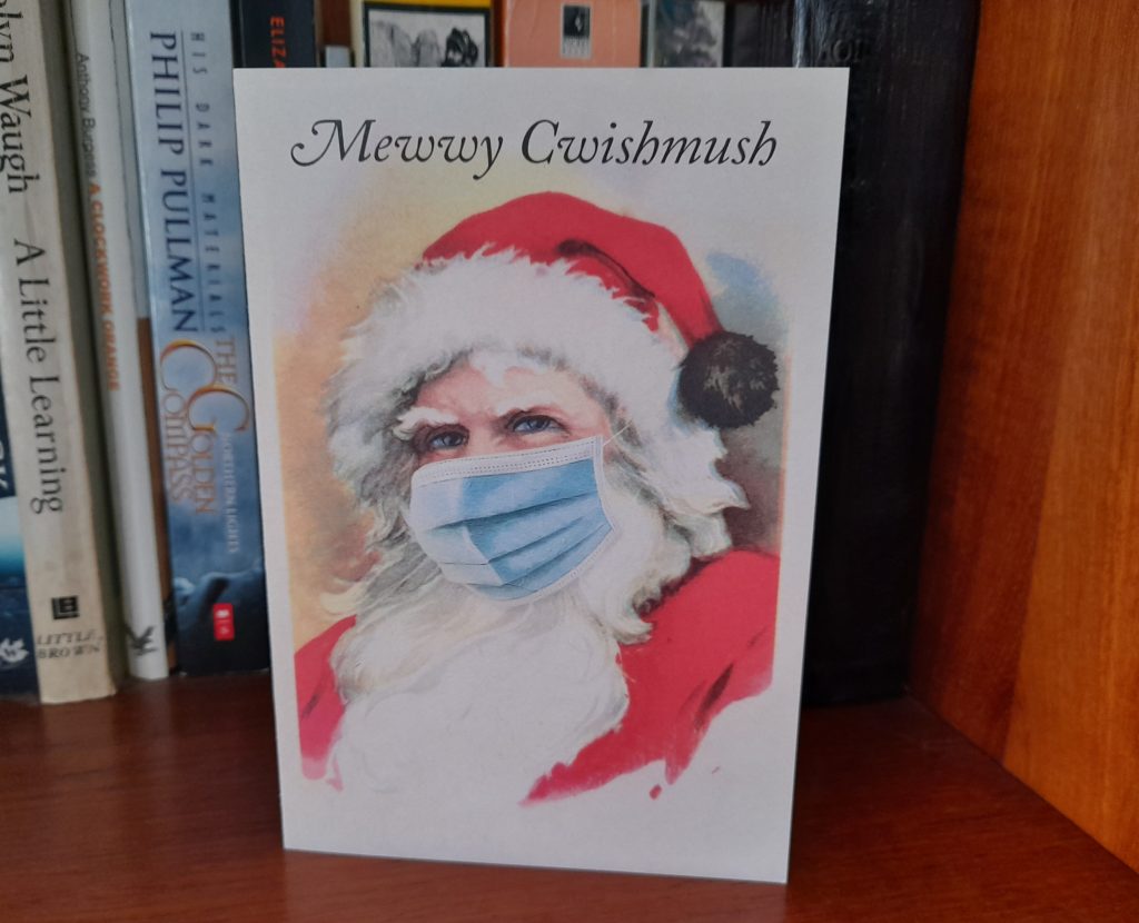
I made a Christmas card for the pandemic era. Design by Music.
LinkedIn loves a good anniversary. So it’s keen to point out that I’ve been freelancing for 10 glorious years. I wanted to spare you the platitudes of how time has flown, but can feel the words forcing themselves out of my mouth, “10 years. My god! I can’t believe it!”
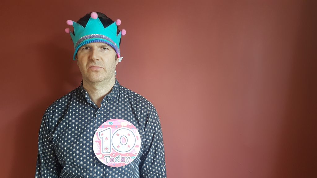
Anyway, to mark this momentous occasion, I thought I’d share with you 10 vaguely useful things that I’ve learned since leaving the cosy world of a permanent job and striking out on my own as a copywriter for hire in UK ad and design agencies.
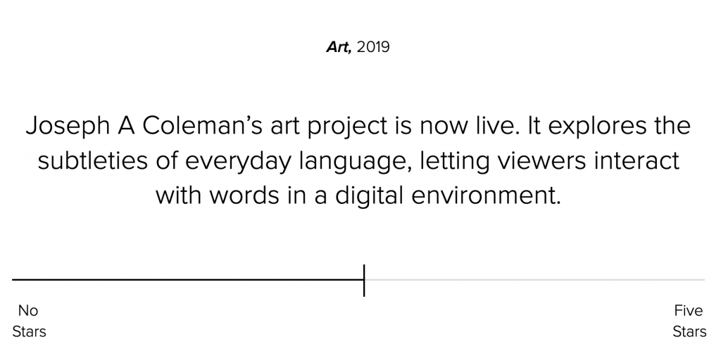
My new art project is now live. Made in collaboration with Music Agency, it uses the slider idea from this website and takes it into some interesting new places.
Over time I’m hoping to experiment with all sorts of different approaches, so it won’t all be about sliders. Look out for updates on my twitter feed @JOETHECOLEMAN
Are different, memorable ads still sneaking out of your agency’s door? Then put a stop to it with these 10 foolproof techniques. From brief writing to post-campaign assessment, they’ll help you keep your work bland, generic and forgettable.
1. Avoid making your proposition single-minded.
Good ads come from distinctive single-minded propositions. So make your proposition broad and vague instead. Get this right and you can nip creativity in the bud, avoiding the awkwardness of having to kill off good ideas later down the line.
HANDY HINT – Use the construction “The smarter way to… [insert product function here]” in your proposition. This makes it sound like it’s single-minded, but actually means more or less nothing. It’s a really effective way to make sure creative thinking stays generic.
e.g. “Heinz Baked Beans. The smarter way to eat lunch.” “Waterstones.com The smarter way to buy books.” “Toyota Auris. The smarter way to drive.”
This year, I was asked to be on the Writing For Design jury at the D&AD awards, which was pretty damn cool. So I jumped on the train down to London and spent a fascinating day with 5 clever, passionate writers from all sorts of different backgrounds. The day gave me a few insights into the judging process and I thought I’d share a few bits of advice on the sort of work you need to be doing if you want to pick up an award.
Winning a pencil actually boils down to one simple thing: Making the judges shout “BASTARDS!”
Your ultimate aim is to make judges so insanely jealous that their only logical and rational reaction is to punch a nearby wall and swear at the top of their voices. You need to be doing work they wish they’d done. You need to be doing something so clever, simple and “just right” that they can’t believe no one has come up with it before.
It’s also relatively straightforward to describe the sort of work that’s going to achieve that, because it falls into 3 broad categories:
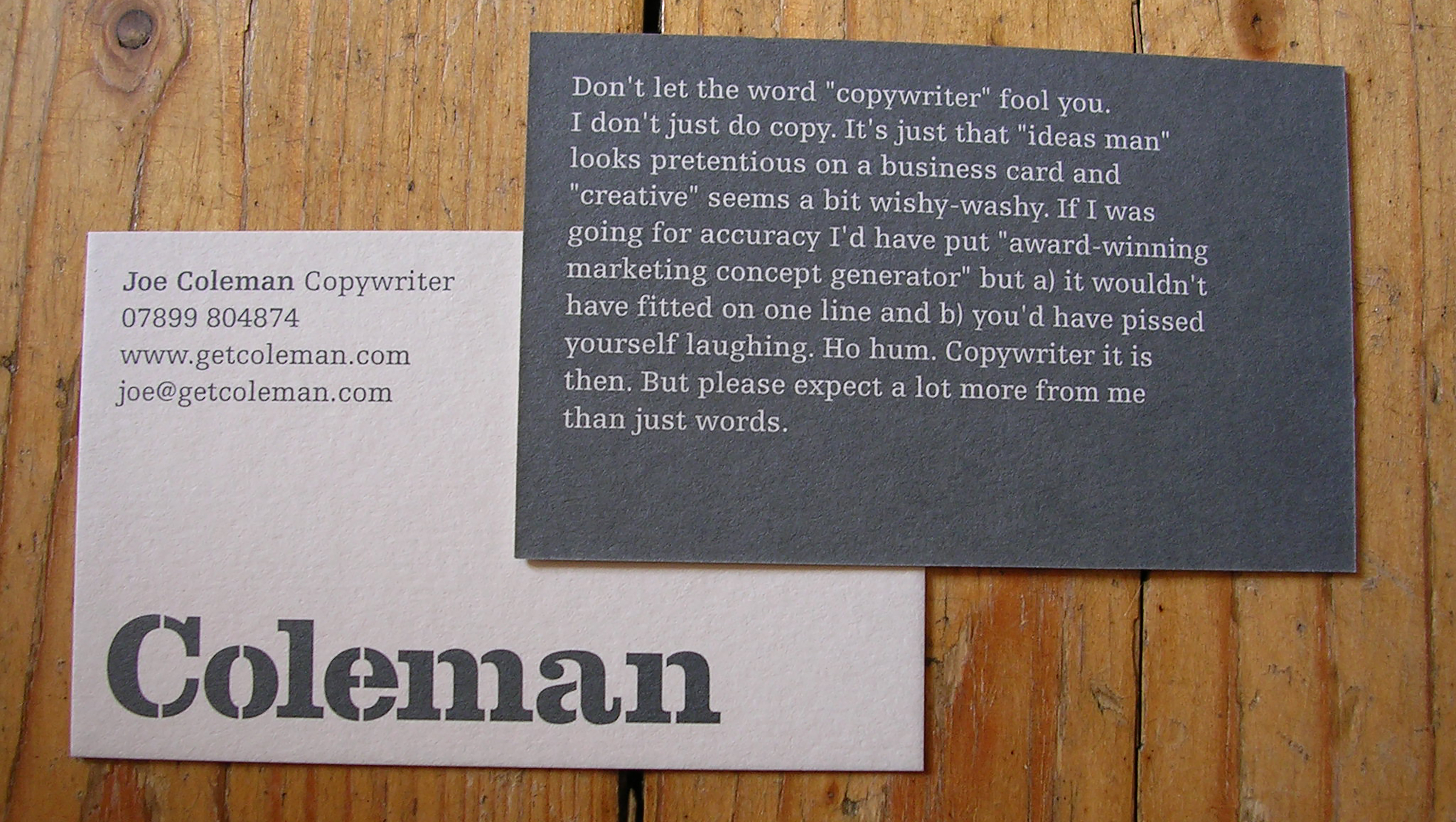
Copywriter. It’s a problematic word. You’d think people who write for a living would have come up with something better by now. But we haven’t. Probably because we’re too bloody busy.
“Copywriter” is problematic because it covers a multitude of different roles, from people who manage companies’ social media accounts to classic ad agency types who sit with an art director and come up with campaigns.
So we’re not all what you think we are. Especially those of us who work in creative teams in agencies. Here’s why:
1.It’s not all about words.
Advertising is primarily a visual form of communication. There, I said it. But it’s also a place where images almost always work with words. So a copywriter’s job isn’t just about words. And it isn’t just about images. It’s about how the two work together.
If a copywriter starts writing headlines without considering how they work as part of a visual communication, they’re only doing half their job. It would be like a comic book writer writing all the word balloons, without thinking about what’s going on in the pictures.
So the word “copywriter” is misleading. Words are only half of what we do.
2. We’re not necessarily good with grammar.
Copywriting isn’t about following the rules of grammar. I don’t even know most of the rules of grammar. I sit and read what I’ve written and if it sounds like someone talking, then it works.
I write sentences with no subject. Like this one. I usually write for a reading age of about ten. And I start sentences with ‘And’ all the time. As for fancy punctuation, I’m with Kurt Vonnegut on that one: “Do not use semicolons. All they do is show you’ve been to college.”

3.Most of us aren’t trained professionals.
Have a look in the dictionary and it will tell you a profession is, “A paid occupation, especially one that involves prolonged training and a formal qualification.” But anyone can declare that they’re a copywriter, whether they’ve had any training or not.
Do I have a diploma proving I’m a copywriter? Nope. Have I done any formal training? Not really. Do I have some letters after my name proving I’m a copywriter? dO I Fu Ck.
So being a copywriter is a bit like being an artist – the difficult bit isn’t “being” one, it’s learning your trade, developing your skills and convincing other people that you’re good at it.
4.It’s anything but solitary.
There’s a traditional image of writers as anti-social hermits who sit bashing away on typewriters in cold rooms. Think Jack Torrance in The Shining. But working in an ad agency is nothing like that at all.