Joe Coleman Menu

100% APR (Amazing Photographic Rates)

Thoroughly enjoyed writing this mock bank letter for one of Manchester’s finest advertising photographers, Paul Moffat. The disclaimer at the bottom was particularly fun!

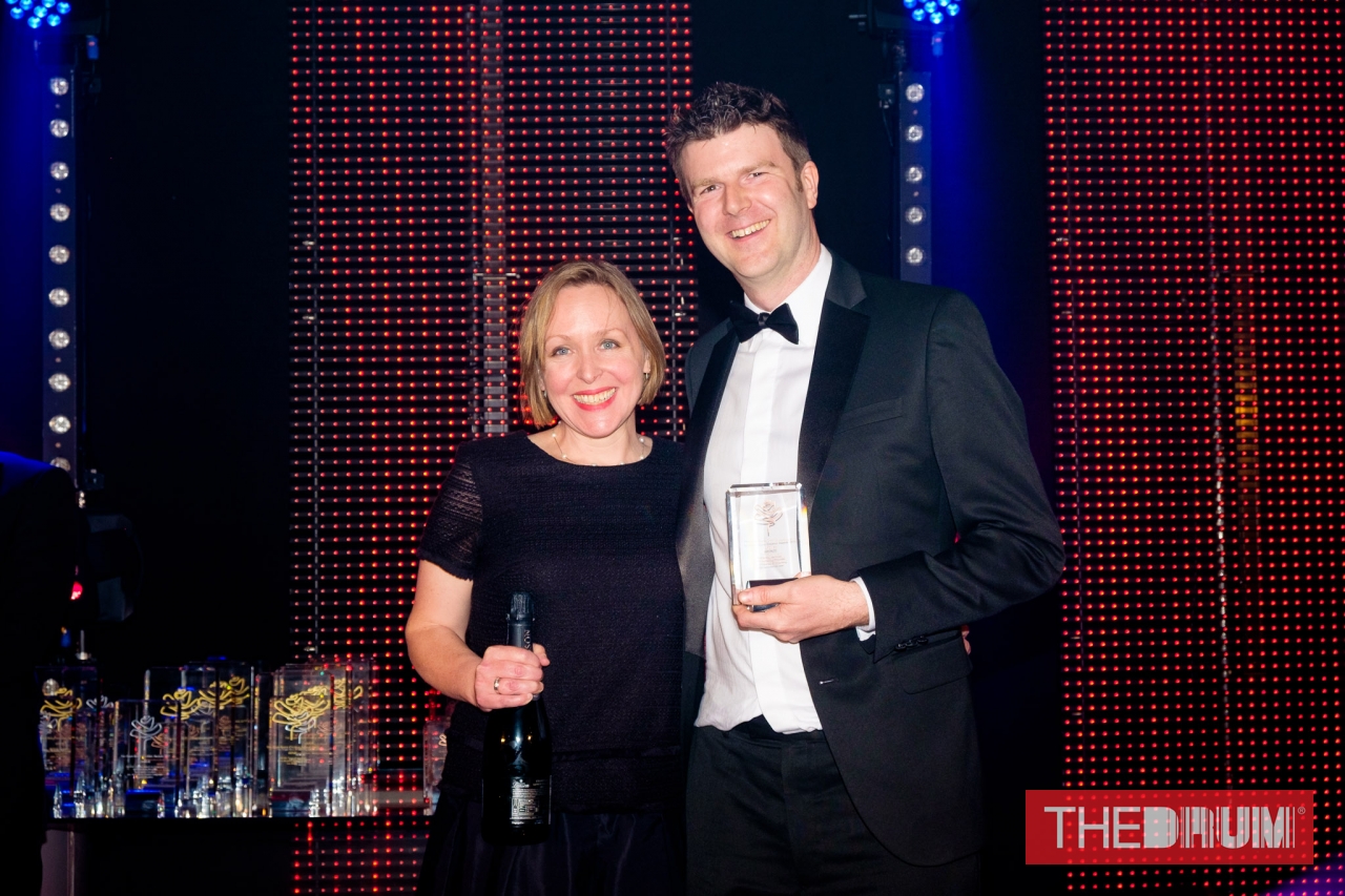
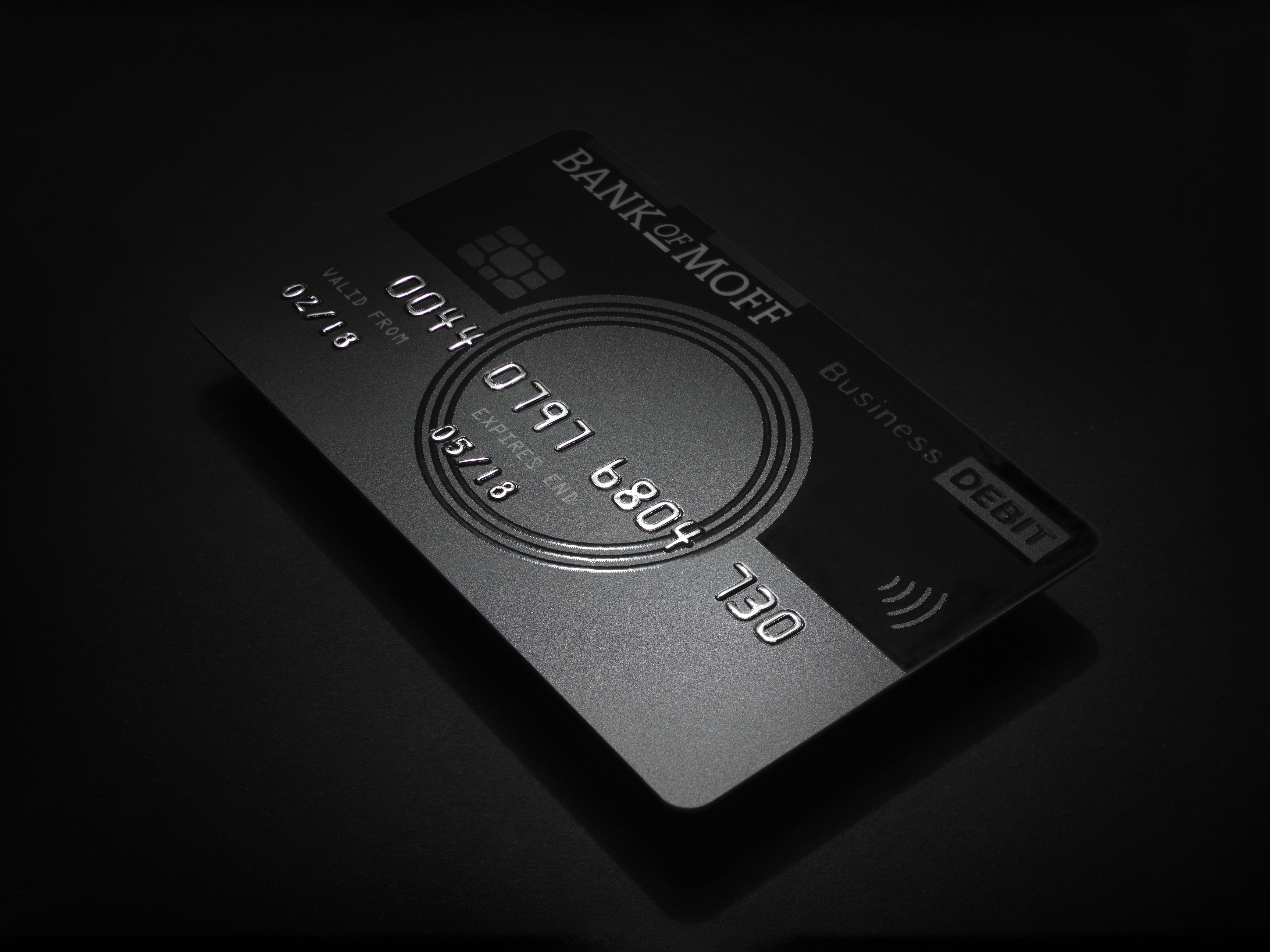
Photographers send Creative Directors mailers all the time and these mailers always include examples of their work. So, we decided to help Paul Moffat stand out. Instead, we sent a bank-style letter, complete with a plastic credit card. It teased Paul’s online image bank, “The Bank of Moff”, and offered a special APR (Amazing Photographic Rate) on the agency’s next shoot. Design and concept by Matt Maurer at Mr M Ideas Studio. This got shortlisted in Item of Self-Promotion at the Drum Design Awards.

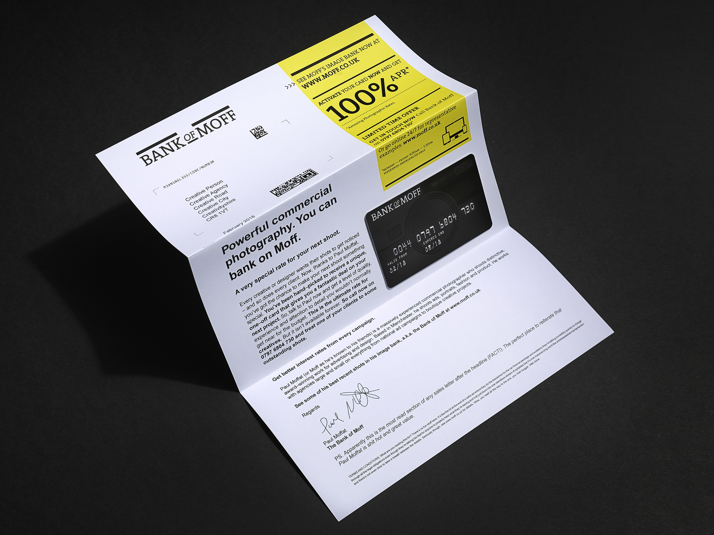
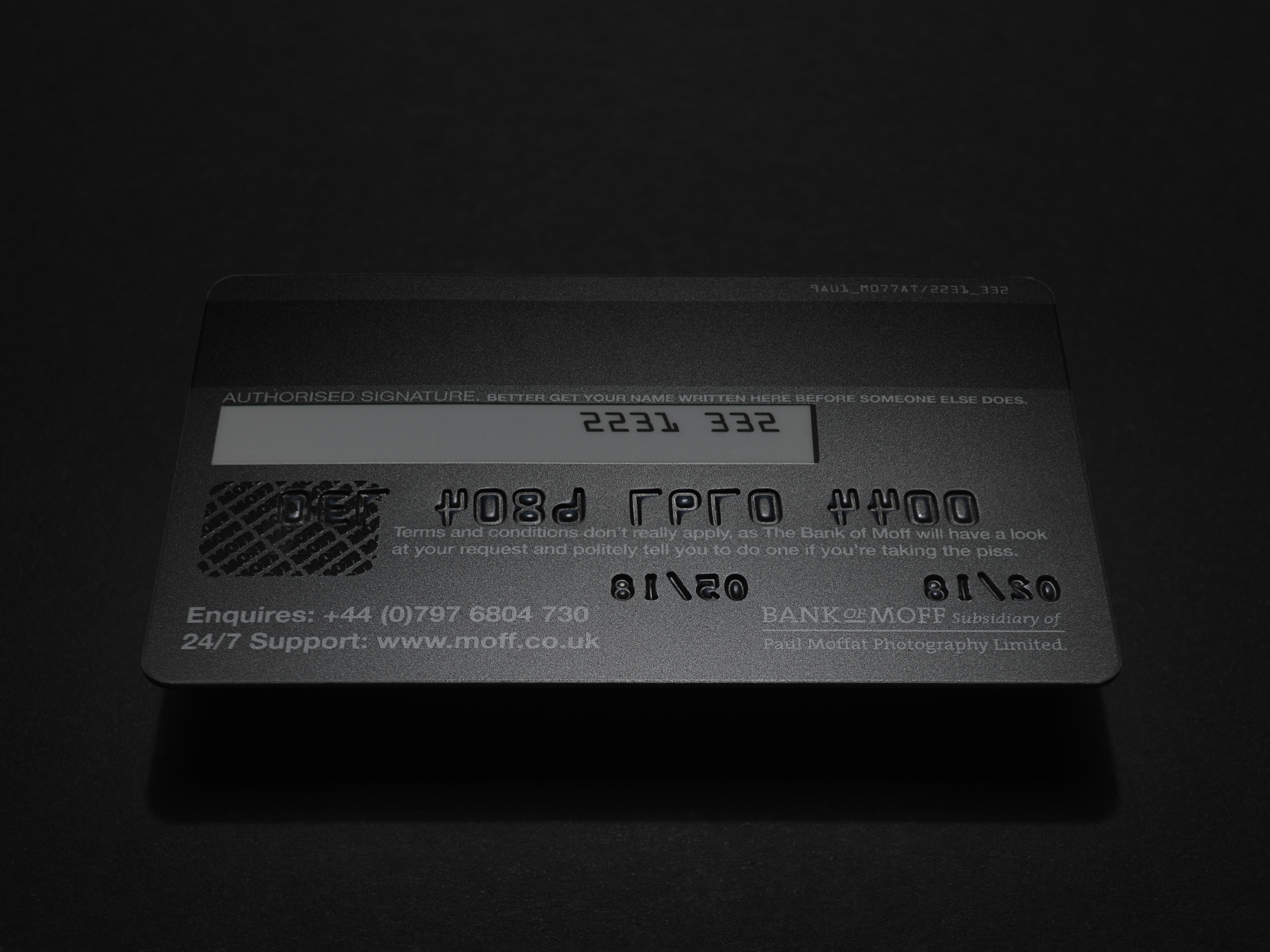
And don’t forget to read the disclaimer!

Come on you Spurs!

I’ve been a spurs supporter since the 1981 FA cup final (the one where Ricky Villa danced through the Manchester City defence to score one of the great Wembley goals). So it was a big tick on the bucket list of lifetime achievements to get to write something for Tottenham Hotspur FC – especially as they’re returning to the new White Hart Lane for a massive season in their history. One Hotspur Members Renewal Pack 2018/19 designed by February.


The making of getcoleman.com

How copywriters live or die by the designers they work with.

In 2017, this website won a D&AD award in ‘Writing for Design’. But that category name was a bit misleading. What people liked about the site wasn’t so much the copy, as the idea. And that came out of a 50/50 collaborative process with the design agency Music in Manchester.

As such, it’s a really good example of how writers work with designers and a great example of how working with great people is the difference between doing good work and work you’re really proud of.


From scribble to finished design.

Here are 5 ways designers made all the difference:

1. To get the ball rolling, I showed Music two approaches that I thought were dead funny. Cue blank looks. “Could we do something else?” they said.

2. When I went in to see Music again, they hadn’t any specific approach in mind, but said “We really like the idea of the site just being words.”

Some of the ref we had for “just words”.


3. The sliding tone of voice idea emerged after we’d discussed loads of different ways to make “just words” interesting. I think my original idea was to have an intro para that you could click on to read in lots of different styles. This then mutated into a sliding bar. It was one of several playful approaches that would be stacked on top of each other as part of a scrolling website. Then came the dreaded words, “We’ve shown the designs to our Exec Creative Director and he had a few thoughts.”

(more…)

HAPPY 2018

Helped The Common Room with this neat Happy New Year card they sent to their clients.

EIZO MONITOR ADS

Worked with Peter & Paul in Sheffield on these ads for EIZO’s professional monitors. Nice to write a few hundred words in an ad for a change. Click on the ads for bigness.


LATES posters

Wrote the copy for these lovely award-winning posters for The National Media Museum’s LATES programme. Concept and art direction by B&W Studio. Images of fading or derelict entertainment venues shot by John Angerson around Bradford in the dead of night. I rocked up after they’d spent weeks crafting them and wrote some copy. They picked up awards at Roses Creative Awards and Drum Design Awards.

Copy:

Bradford’s late-night entertainment alternative.

Take your nights somewhere dark and new with LATES at the National Media Museum. This experimental programme of after-hours entertainment is filled with cutting edge science and exciting talks.

It takes a few risks. It broadens horizons. It takes your evenings off the straight and narrow. Embrace the dark and discover Bradford nightlife like you’ve never seen it before.


2017 awards update

Been a great year for awards and weirdly I get to keep most of them, as they were for my own promotional material, rather than work for agencies. One of them was a graphite D&AD pencil, which means my ego is now swollen to the size of a Pacific island. Best not book me for a few weeks. I’ll be unbearable. Anyway, here’s the full list:

D&AD Graphite Pencil in Writing For Design (for this website)

Roses Gold for Copywriting (for this website)

Roses Bronze for Website (for this website. The stingy buggers!)

Roses Silver x2 for Poster & Photography (for LATES at the National Media Museum – work done for B&W Studio)

Roses nomination for Item of Self-Promotion (for Agency Crap Pot Plant Diary)

Roses nomination for Poster (for Brookes – work done for B&W Studio)

Roses nomination for Identity (for LATES at the National Media Museum – work done for B&W Studio)

I’d best get this cleared then!

PS At the Roses Awards I was put to shame by my wife, who beat a room full of advertising professionals to win the #OneMinuteBrief award. We got to stand on stage together though, which was really nice. Well done Rach!

The wonder and weirdness of going viral.

On 28th March, this website got nominated for a couple of Roses awards. Thanks judges! The next day a few people tweeted about how much they liked my site. Fast forward 10 days and I had hundreds of emails in my inbox, my Linkedin message box was creaking, I had 20 times as many twitter followers and a bloke was on the phone from my hosting provider telling me I’d crashed one of their servers.

Highlights of this 2 weeks of madness included:

A lengthy thread on Hacker News, mentions on It’s Nice That and Hover States.

Praise from Dave Trott.

And this interview with Adweek with the most flattering headline of all time.

But perhaps the nicest thing was getting lovely emails from total strangers, such as this one:

“So, I’m sitting at work on a Saturday (sigh) eating leftovers for lunch and scrolling through my Facebook feed to see how great the lives of my friends are when a link pops up to your site joecoleman.localhost

I’m over the other side of the world, my agency doesn’t need a copywriter and I should really be writing a baby toy brand strategy right now, but I just wanted to take five minutes to say – love your site, man.

Kudos.

Angus”

Thanks everyone. It’s been a lot of fun.

Have you stepped into an award-winning design studio?

Have you stepped into an award-winning design studio?
Look for these 17 giveaway signs in 2017.

  1. You’re in a tasteful mill/factory/church conversion.
  2. Several very expensive road bikes are hanging on the wall.
  3. Radio 6 Music is playing.
  4. There are beards.
  5. An eager intern is asking you if they can get you a drink.
  6. An awards trophy from the noughties is being used as a doorstop.
  7. There’s a white IKEA Expedit bookcase full of Laurence King and Phaidon books.
  8. There’s a pile of Howies catalogues on it too.
  9. There’s a shelf full of pencil-shaped statuettes and slabs of glass.
  10. People are sniffing the pages of new print as if that’s a normal thing to do.
  11. Someone’s walking around with a camera.
  12. A pile of D&AD annuals are being used as a laptop stand.
  13. There’s decent 120gsm paper in the printer.
  14. There’s a mural.
  15. You can smell proper coffee.
  16. Plastic Japanese action figures worth a fortune on ebay are sitting on people’s desks.
  17. No one has any idea when the Creative Director is next going to be free. Or indeed where they are.

Introducing ‘The Agency Crap Pot Plant Diary 2017’

Just produced these as a mailer for my advertising and design agency clients. 12 shots of hopeless horticulture collated over 5 years in the North’s top agencies. Design by Caslon & Co. Want one on your desk? Of course you do. Then buy yours here [SORRY – SOLD OUT. Email me if you’re desperate for one!].

UPDATE March 2017 – This was nominated in Best Item of Self-Promotion at the Roses Creative Awards.

3-diaries-in-pile-medium bw-spread-medium hub-plant-medium red-diary-solo-medium spines-medium