The making of getcoleman.com
23 January 2018How copywriters live or die by the designers they work with.
In 2017, this website won a D&AD award in ‘Writing for Design’. But that category name was a bit misleading. What people liked about the site wasn’t so much the copy, as the idea. And that came out of a 50/50 collaborative process with the design agency Music in Manchester.
As such, it’s a really good example of how writers work with designers and a great example of how working with great people is the difference between doing good work and work you’re really proud of.

From scribble to finished design.
Here are 5 ways designers made all the difference:
1. To get the ball rolling, I showed Music two approaches that I thought were dead funny. Cue blank looks. “Could we do something else?” they said.
2. When I went in to see Music again, they hadn’t any specific approach in mind, but said “We really like the idea of the site just being words.”
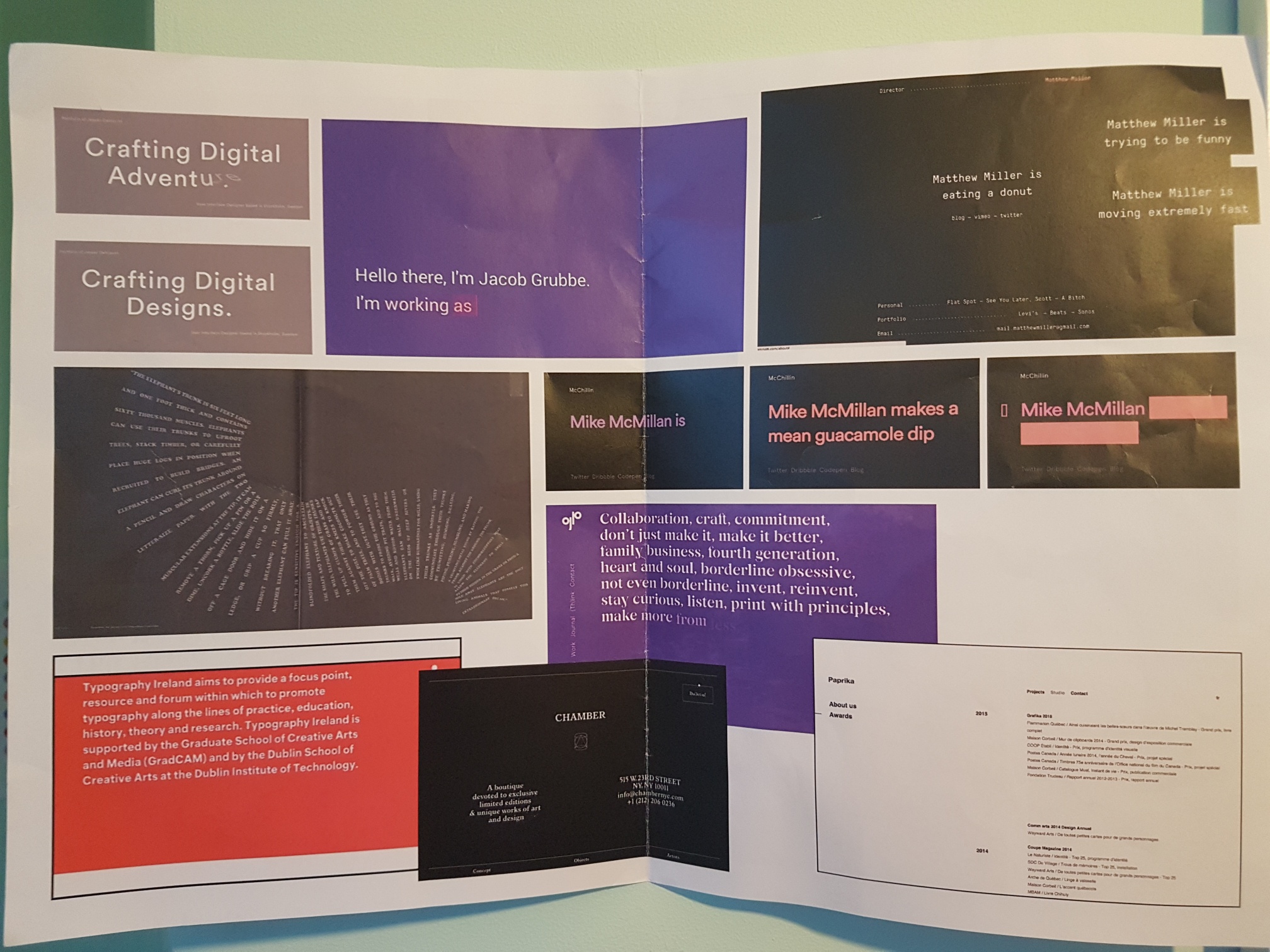
Some of the ref we had for “just words”.
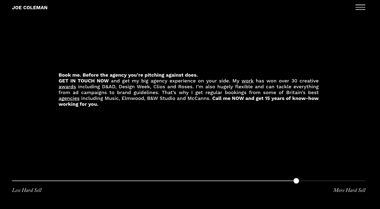
3. The sliding tone of voice idea emerged after we’d discussed loads of different ways to make “just words” interesting. I think my original idea was to have an intro para that you could click on to read in lots of different styles. This then mutated into a sliding bar. It was one of several playful approaches that would be stacked on top of each other as part of a scrolling website. Then came the dreaded words, “We’ve shown the designs to our Exec Creative Director and he had a few thoughts.”
Music’s ECD, David Simpson, thought we should make the whole site about the sliding bar, as this was by far the most exciting idea in the design. I have to admit to sighing when this news was relayed to me, as I was in love with the design we had. But I thought I‘d give it a fair chance. And once I started thinking about it, I realised he was dead right.
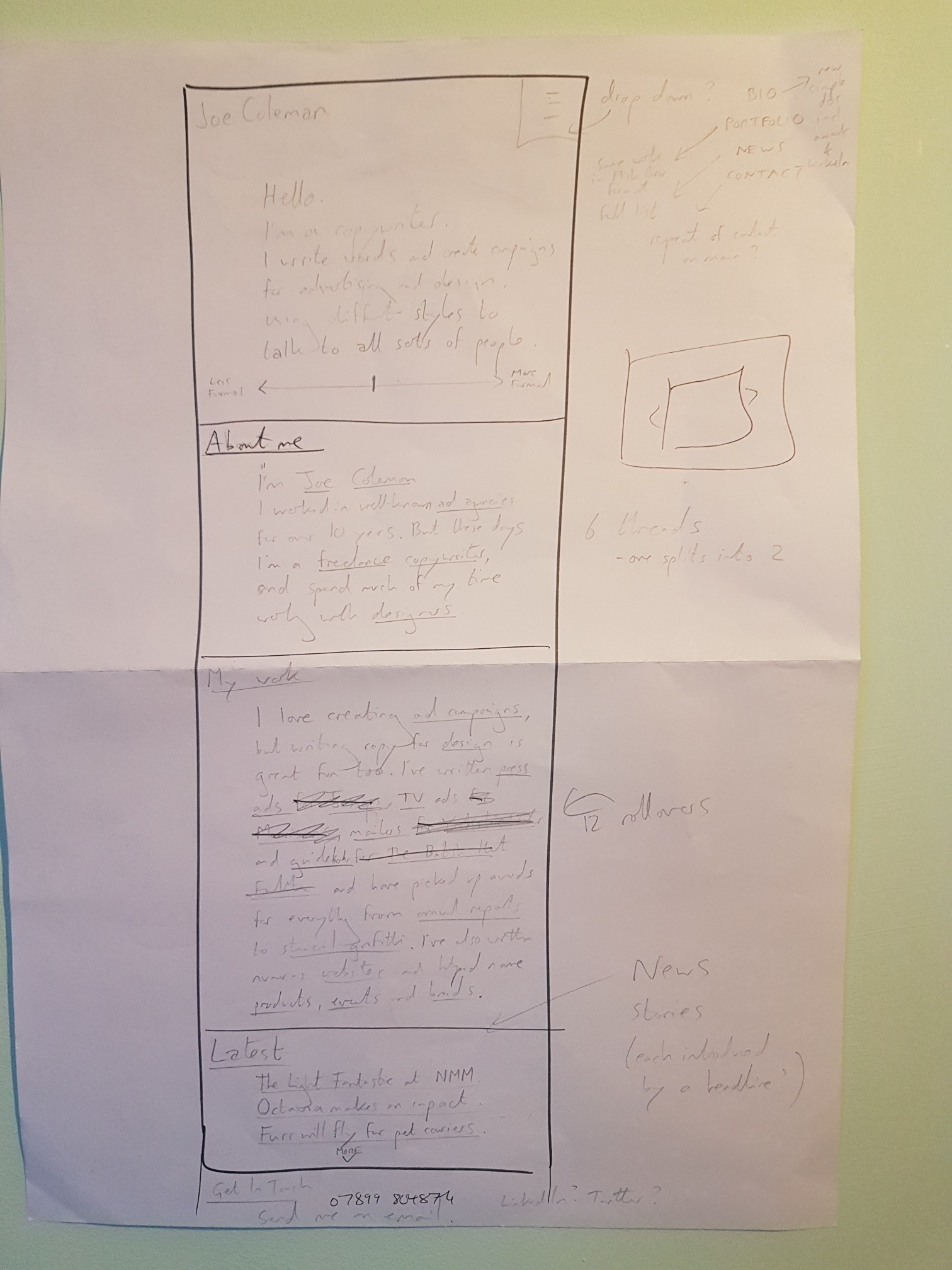
The original scrolling design
4. As with any project, we made hundreds of micro-decisions as we went along. Should the sliding scale be from “formal” to “casual” or from “hard sell to “soft sell”? Should the font change as the messages change? How many versions of the copy did we need to make this work? How early should the images start to appear? Were images a good idea, in fact – wasn’t this supposed to be about words? Between me, Orla the Creative Director and Mike the developer, I think we got most things right.
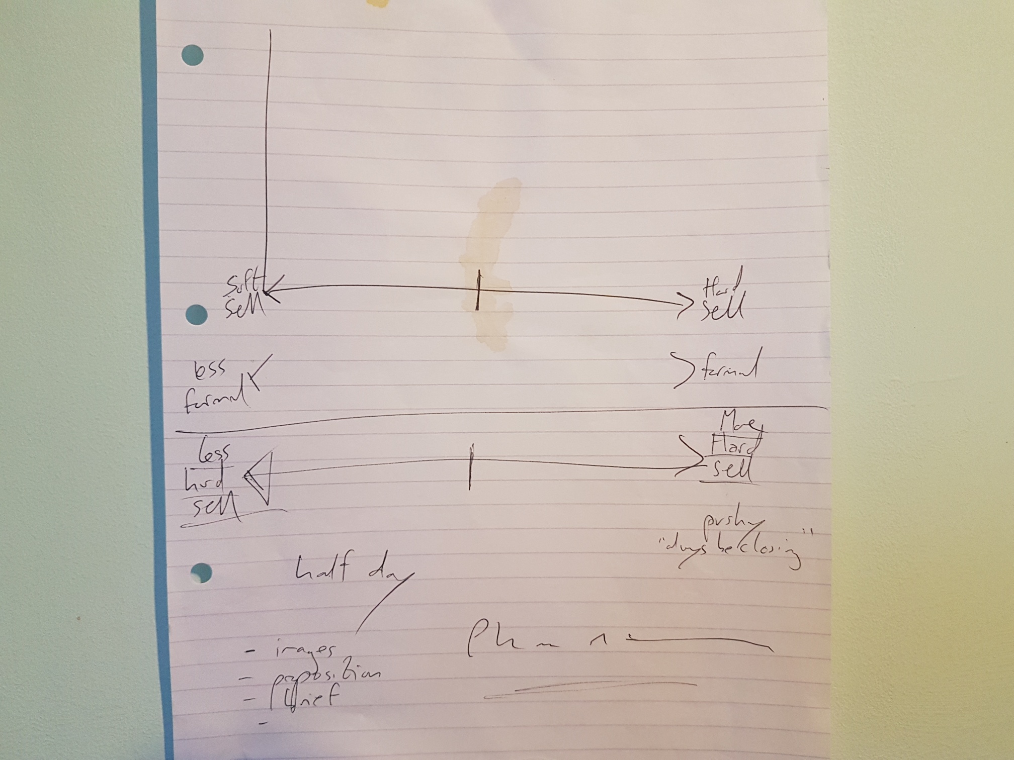
More scribbles
5. From the off, I’d hoped the site would be interesting enough to win industry awards, as the people who paid attention to them were exactly the people I wanted to impress. I owe the D&AD win to the sagely advice of Music’s Adam Rix (who’s won an award or two in his time). He said, “The trouble with smaller websites is that you’re always up against some kind of massively technologically advanced effort from AKQA or Nike or something. My advice would be to stick it in self promo / writing for digital categories if I were you.” Thanks Mr Rix.